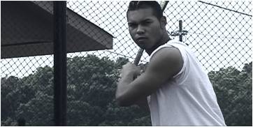
| This is a direct comparison between what
the original footage shot looked like before and after I applied filters
and the like. Using filters, color tints, and simple blurs can achieve
wonders. Although, style by itself should not be the initial motivator,
when used tastefully can add a different, almost visceral, texture to a
piece. |
| // BEFORE |
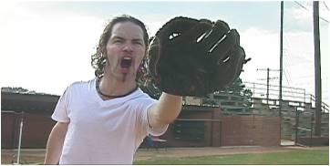
// AFTER |
|

|
|
|
| Every shot in the commercial had filters applied to achieve
the look. I desaturated the images - pulling out around 65% of the color
information. This varies with each shot depending on original color intensity.
I then boosted the contrast to get the dark, edgy look while at the same
time adjusting brightness if the shot required it. Next, I added a very
important blue tint that will tie all the shots together visually. |
|
|
|

|
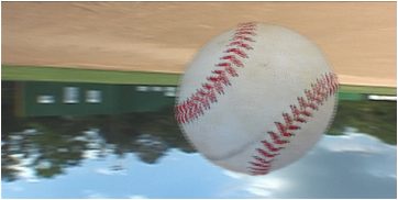
| This shot consisted of a background plate and a baseball
layer. I took the background footage, in which I turned the camera on the
tripod around 360 degrees, and applied the filters mentioned above. I then
sped it up to around 250%. I added a Gaussian blur followed by a
Wind blur to give it even more directional motion. The baseball is actually
a hi-res still I took on set. I cleaned it up - removing the ball from
the background and eventually brought it into the editor. I keyed out the
black space where the background had been just leaving the ball. I applied
the standard filters, motion blurred it and rotated it as it passed across
the screen. Adding a panning whoosh as the ball passes lends to the effect. |